Cut Interior Design Revision Rounds in 2026: The Visual-First Approval Workflow (That Still Feels Premium)
If you’re an interior designer, you already know the pattern:
You send a concept deck.
The client says they “love it”…
…and then asks for “just a few tweaks.”
Two weeks later, you’re on revision round four. The design might actually be getting worse. Your margin definitely is.
This isn’t because your client is “difficult.” Most revision chaos comes from one root problem:
The client can’t confidently see the outcome early enough to make a decision.
In 2026, the bar for clarity is higher than it used to be. Clients have seen thousands of perfectly lit interiors on Instagram and Pinterest. They don’t just want inspiration — they want certainty.
The good news: you don’t need to turn every project into a full 3D modeling exercise to get that clarity.
You need a better approval workflow — one that moves from vibes → visuals → decisions, without losing your signature taste or your professional authority.
This guide gives you a repeatable, designer-friendly system to:
reduce interior design revision rounds
keep clients aligned (even when there are multiple stakeholders)
shorten the time between “first concept” and “approved direction”
present ideas in a way that feels premium — not “cheap AI”
And yes: we’ll show where Clara fits naturally as a visual transformation step (not a replacement for your expertise).
---
Why revision rounds explode (and why it’s not your fault)
Revision rounds usually explode when one of these is true:
1. The client is reacting to abstraction. Mood boards, floor plans, and item lists are useful — but they don’t always translate into “I can picture living there.”
2. You’re asking for decisions before the client feels safe. Buying a sofa, choosing a paint, or approving a kitchen layout can feel irreversible. When clients feel risk, they delay.
3. Your “presentation” is trying to do three jobs at once. Many decks combine:
inspiration
concept direction
final selection-ready details
That’s too much, too soon.
4. There’s a hidden stakeholder. The partner. The friend. The “committee.” The investor. The landlord. The HOA. If they aren’t bought in, you’ll get ping-ponged.
5. Your visuals don’t match the client’s mental model. The client says “warm minimal,” but is imagining something totally different. Without visuals, you find out late.
The fix is not “try harder” or “write longer explanations.”
The fix is a workflow that creates shared visual truth early — while it’s still cheap to iterate.
---
The 2026 visual-first approval workflow (5 stages)
Think of this as your repeatable process for moving a client from uncertainty to approval.
Stage 1: Define the decision (not the style)
Before you show any visuals, define what “approval” means for this phase.
Use this template:
“At the end of this step, we are approving…”
the overall design direction (not every product)
the room’s mood (warm/calm/bright/dramatic)
the layout approach (e.g., conversation zone vs TV-first)
the palette direction (e.g., warm neutrals + black accents)
We are not approving:
exact SKUs
final joinery details
final window treatment choice
Why this matters: when you don’t define the decision, clients keep reopening everything.
Deliverable (1 page)
“Decision for today” headline
3–5 bullet “What’s in / what’s out”
“Next decision” placeholder
---
Stage 2: Mood board (keep it emotional, not literal)
Mood boards still matter — but use them for what they’re best at:
atmosphere
material direction
texture story
color family
references that “feel like” the outcome
Avoid turning the mood board into a shopping list too early. When clients latch onto items, they start debating details instead of direction.
Best practice (2026): keep the mood board to 8–15 elements max.
Pro tip: Name the mood
Give the mood board a name the client can repeat:
“Soft Architectural Warmth”
“Hotel Calm, Not Sterile”
“Modern Heritage”
When clients can name it, they can approve it.
---
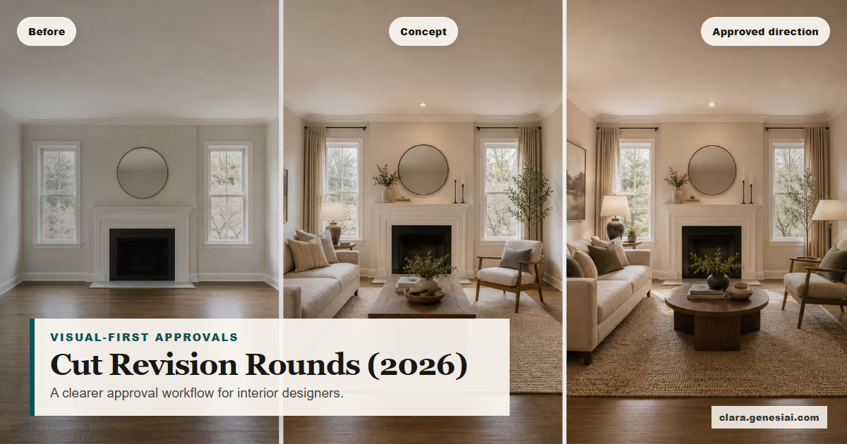
Stage 3: Visual concepts (this is where approvals get faster)
This is the step that dramatically reduces revision rounds:
Show the client their actual room with 2–3 concept directions.
Not 12 options. Not infinite exploration. Just enough contrast to:
confirm what they truly mean by “modern”
reveal what they dislike early (cheap to change)
secure an emotional “yes” to a direction
This is where Clara fits naturally.
How to use Clara (designer-friendly, low-prompt)
1. Start with the client’s room photo. Use one clean, wide-angle shot whenever possible.
2. Pick a direction via style or reference.
If you have strong references: use them as the “north star” look.
If the client has a Pinterest board: choose 1–3 images that represent the true direction (not the noise).
3. Generate 2–3 variations. Variation examples:
“Warm minimal” vs “warm contemporary classic”
“Light + airy” vs “moody evening”
“Natural textures” vs “clean architectural”
4. Label each concept with the decision it supports. Not “Option A/B/C” — use names that describe intent:
“Calm + Clean”
“Textured + Warm”
“Graphic + Bold”
5. Collect reactions with structured questions. Ask:
“What feels most like you?”
“What feels like a hard no?”
“What element is non-negotiable?”
This turns a vague “I like it” into decision-ready feedback.
Important guardrail: treat AI concept visuals as directional visualisations. You still validate feasibility, measurements, sourcing, and budget the professional way.
---
Stage 4: Decision-ready presentation (reduce backtracking)
Once the client approves a direction, shift to a deck that is built to prevent backtracking.
Structure it like this:
1. Before photo (their current room) 2. Approved direction visual (the selected concept) 3. 3 “non-negotiables” (what must stay true) 4. Material + palette board (tightened) 5. Key pieces list (only the top 5–8 items that set the room) 6. Next decisions + timeline (what happens next)
This gives the client a narrative:
“Here’s where we are → here’s where we’re going → here’s what stays consistent.”
That narrative is what stops revision creep.
---
Stage 5: Stakeholder alignment (the fastest way to avoid surprise revisions)
If you suspect there’s a stakeholder who isn’t in the room, build your workflow around it.
Use this simple rule:
No stakeholder = no approval.
Practical ways to handle this:
Send the “approved direction” deck within 24 hours
Include 2–3 visuals (not just words)
Add a short “Why this works for you” paragraph
Ask for a reply that includes both stakeholders: “Which direction are we approving today?”
If you can’t get everyone on the same page, your revision rounds will keep multiplying.
---
The “revision-cutting” script you can use in your next client call
Here’s language that keeps you premium and in control:
> “To keep this project efficient and enjoyable, we’re going to approve direction first, then details. Today, we’re choosing the visual direction that feels right in your actual room. Once we lock that in, the next steps become much faster — and we avoid endless revisions.”
Clients usually appreciate this. It feels professional and protects them from decision fatigue.
---
A practical 7-day implementation plan (for busy designers)
Day 1: Add the decision definition page
Create a 1-page template: “Decision for today / not deciding today”
Day 2: Tighten your mood board rules
Cap at 8–15 elements
Name the mood
Day 3: Build a “concept sprint” deck template
Before photo + 2–3 concept visuals + reaction questions
Day 4: Run the first concept sprint with a real client
Keep it to 30–45 minutes
Day 5: Convert the approved direction into a decision-ready deck
Non-negotiables + palette + 5–8 key pieces
Day 6: Add stakeholder steps
“Who must approve this?” becomes a standard question
Day 7: Review and refine
What caused confusion?
Which visuals got the fastest “yes”?
---
Common mistakes to avoid (especially with AI visuals)
1. Showing too many options. More options = more uncertainty.
2. Letting the client think visuals = final spec. Always frame as “directional visualisation,” then move into specs.
3. Using “cheap-looking” imagery. If the output looks unrealistic, don’t present it. Your brand is the deliverable.
4. Skipping the “non-negotiables” slide. Without it, clients keep reopening foundational decisions.
5. Not capturing decisions in writing. A single email recap can prevent weeks of back-and-forth.
---
How Clara supports a premium, visual-first design workflow
Clara is an AI-powered visual transformation platform designed to turn ordinary images into persuasive visuals.
For designers and decorators, that means you can:
transform a client room photo into multiple concept directions in minutes
show a client “what you mean” without weeks of rendering work
reduce the imagination gap that causes delays and revision loops
build decision-ready decks that keep the project moving
Clara isn’t a replacement for your taste, feasibility checks, sourcing expertise, or project management. It’s a visualisation accelerator — so you spend less time explaining and more time designing.
Try Clara with your next consultation: https://clara.genesiai.com
---
FAQ
Do mood boards still matter in 2026?
Mood boards are excellent for emotion, material direction, and a shared aesthetic vocabulary. They’re just not always enough for approvals on their own.
Will clients think AI visuals are “fake”?
They can — if you present them as final or if the images look unrealistic. Frame them as directional visualisations of the client’s space used to choose a direction faster.
What if a client wants infinite options?
Offer a bounded “Concept Sprint” package: 2–3 directions, one refinement round, then you move forward. Boundaries reduce revision cycles.
---