Small Kitchen Color Trends 2026: 7 Looks to Test in Your Own Kitchen Before You Paint
Small kitchens are not trying to disappear.
They are getting warmer. More expressive. More layered. Less apologetic.
That matters if you are standing in a compact kitchen right now, staring at white cabinets, tired walls, or a space that feels more functional than inviting. The old default was simple: keep everything pale, play it safe, and hope the room feels bigger. The 2026 shift is more interesting than that. Designers are talking about deep blues, muted greens, earthy wood tones, reflective details, softer lighting, and kitchens that feel more like lived-in rooms than stripped-back utility zones.
The problem is that trend inspiration is easy to save and hard to apply.
A color that looks rich and tailored in a magazine kitchen can feel heavy in your north-facing flat. A muted green that feels calm in one home can turn flat in another. A mirrored splashback or darker cabinet finish might make your kitchen feel layered and elegant, or make every crumb and fingerprint more obvious than you want.
That is where visualisation becomes useful.
Instead of painting first and regretting it later, you can test the direction in your own kitchen. Clara lets you upload a photo of your actual space and generate realistic kitchen variations before you buy paint, choose temporary renter-friendly upgrades, or start briefing a professional.
This guide covers the small kitchen color trends gaining momentum in 2026, what they solve, and how to test them in your own room before you commit.
Why small kitchens are changing in 2026
For years, the default advice for compact kitchens was predictable: paint everything white, keep details minimal, and avoid anything too dark, too warm, or too personal.
That advice is losing ground.
Homes & Gardens' small kitchen color trend coverage for May 25, 2026 points to deeper blues, muted greens, and earthier palettes replacing the assumption that white is always safest. Its wider small-kitchen trends coverage also highlights mirrored surfaces, pattern, softer lighting, and more lived-in styling.
Houzz's 2026 U.S. Emerging Summer Trends Report reinforces the same direction from a different angle. Its late-May search-led report describes homeowners gravitating toward tactile, sensory-rich rooms with warmer palettes, curved forms, and more personal character.
The commercial implication is simple: people do not just want a kitchen that looks bigger. They want one that feels better.
That means:
More warmth instead of clinical brightness
More personality instead of generic neutrality
More visual confidence before spending money
If you have a compact kitchen, this is useful news. A small room does not need to look safe. It needs to look intentional.
The risk of following trends without testing them
Small kitchens are unforgiving.
Every finish reads louder. Every color shift affects the whole room. Every layout choice is more visible because there is nowhere for weak decisions to hide.
That makes trend content both inspiring and dangerous.
Here is what usually goes wrong:
You choose a dark cabinet color because it looked elegant online, then discover your kitchen gets too little light for it to feel inviting.
You pick a muted green because it felt current, then realise it clashes with your worktop undertone or tiled floor.
You add patterned details and vintage styling, then the room tips from collected into busy.
You assume a "small-space trick" will work universally, even though your room shape, window placement, and cabinetry proportions are different.
This is why a visualise-first workflow matters.
Clara is not there to tell you what taste you should have. It helps you answer a more useful question: what does this direction look like in my kitchen, not somebody else's?
That is valuable whether you are:
repainting walls
considering cabinet color changes
choosing removable renter-friendly styling
testing shelving, stools, lighting, or splashback ideas
creating a clearer brief for a designer or contractor
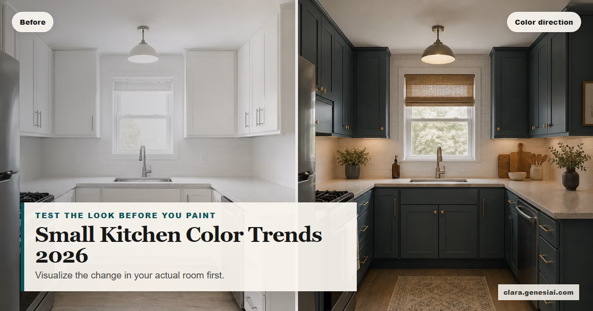
1. Deep blue kitchens that feel tailored, not cramped
One of the clearest 2026 shifts is the return of deeper blue tones in small kitchens.
This works because blue can add depth without feeling flat. In the right kitchen, it creates a cocooning, custom feel that is much more elevated than default white. It can also work well with brass, wood, marble-look finishes, and warm lighting.
Why homeowners like it:
It makes a compact kitchen feel designed rather than temporary
It pairs well with mixed materials
It helps plain cabinetry feel more architectural
What to watch:
Low natural light can make deep blue feel too heavy
Cool-toned blue can feel harsh against grey flooring
Too much contrast with bright white surfaces can make the room feel choppier, not calmer
How to test it in Clara:
Upload your kitchen photo and generate three versions:
1. Deep blue lower cabinets with lighter upper walls
2. Full blue cabinetry with warm metal accents
3. Deep blue with softer off-white walls and wood shelves
Do not just ask whether it looks stylish. Ask whether it still feels liveable at breakfast, on a dark weekday evening, and in the kind of light your kitchen actually gets.
2. Muted greens that soften a compact kitchen
Muted green is still strong in 2026, especially in small kitchens where people want calm without sterility.
This is a useful trend because green often behaves almost like a neutral. It can add character while staying easier to live with than a louder statement color.
Why it works:
It softens hard kitchen lines
It pairs naturally with wood, stone, cream, and brass
It makes compact kitchens feel less like utility boxes
Where it can go wrong:
Green undertones can become muddy under poor lighting
The wrong green can make laminate worktops look cheaper
Too many earthy elements can push the room into flat beige-green sameness
How to use Clara well here:
Generate side-by-side versions of:
pale green cabinetry
sage walls with neutral cabinets
green plus wood shelving
green plus checkerboard or patterned floor styling
This is exactly the kind of decision that looks obvious in trend roundups and much less obvious in your own room. Visualising it first helps you see whether the green lifts the space or dulls it.
3. Earthy woods and warm neutrals that make white kitchens feel less cold
Another 2026 direction is not really about one paint color. It is about moving away from cool, blank white toward warmer, more layered neutrals.
That could mean:
mushroom and stone walls
oat, parchment, or clay-adjacent neutrals
more visible wood grain
cream instead of bright white
warmer styling accents
This trend is useful for people who do not want a dramatic kitchen, but do want one that feels more considered.
It is especially strong if:
your kitchen opens into a living or dining space
you want the room to feel softer and more cohesive with the rest of the home
you are working with existing cabinetry and only want a low-disruption update
For renters, this may be the most practical direction because you can test it through styling, lighting, hardware, temporary coverings, or removable accents before asking for approval on anything more permanent. Any statement about what is landlord-approved should be treated carefully and checked case by case.
How to test it:
Use Clara to compare:
bright white plus black accents
warm white plus wood
soft stone walls plus cream cabinets
earthy neutral palette plus open shelving and softer lighting
The point is not simply to make the kitchen look warmer. It is to see whether warmth makes the room feel calmer, better connected, and more expensive than it does now.
4. Reflective details that bounce light without going full gloss
Small-kitchen trend coverage in 2026 also points to mirrored or reflective elements. This is less about creating a flashy kitchen and more about using light strategically.
In compact kitchens, reflective finishes can:
make narrow rooms feel deeper
lift dark corners
break up heavy cabinetry
add texture without adding clutter
That might mean:
a mirrored splashback
softly glazed tiles
glass-front cabinetry
pearlescent lighting
polished metal details
The risk is obvious. Reflective finishes can also feel too fussy, too cold, or too high-maintenance if they do not fit the kitchen style.
How Clara helps:
Rather than imagining whether a mirrored detail will look elegant or chaotic, you can test:
a mirrored splashback behind open shelves
reflective tile just along one wall
softer glossy accents paired with warmer cabinetry
In many kitchens, the answer is not "yes" or "no" to reflectivity. It is how much is enough.
5. Pattern and character that stop a small kitchen feeling flat
Another 2026 shift is the move toward personality in compact kitchens.
That can mean:
checkerboard flooring
vintage-style artwork
cafe curtains
decorative lighting
open shelves that feel styled, not sparse
Done well, this makes a small kitchen feel collected. Done badly, it makes it feel visually noisy in under ten seconds.
That is why trend content alone is not enough. Pattern has to work with the room proportions, not just with the broader aesthetic.
If you want to explore this direction, Clara can help you test:
whether the room needs one patterned element or several
whether a stronger floor anchors the room or overwhelms it
whether open shelves feel charming or too exposed
whether "lived-in" styling improves warmth or creates clutter
If your kitchen already has busy worktops, visible appliances, and mixed materials, you may need less added pattern than trend imagery suggests.
6. Softer lighting that makes a kitchen feel like part of the home
One of the easiest ways to make a compact kitchen look more expensive is not a color change. It is better lighting.
Small-kitchen trend coverage this year points to softer pendants, milky glass finishes, and more ambient character rather than one harsh overhead fitting doing all the work.
This matters because color decisions are not separate from lighting decisions.
The same cabinet color can feel:
flat under cold overhead light
warm and rich under layered lighting
smaller in a room with poor evening atmosphere
more balanced when the light helps distribute attention
That is one reason people regret kitchen updates. They change the color but not the conditions that make the color work.
When testing kitchen directions in Clara, include lighting instructions:
"warmer pendant lighting over the table"
"soft under-shelf glow"
"less stark overhead lighting"
"more ambient evening kitchen atmosphere"
You are not just testing what the room looks like at noon. You are testing how it feels when you actually use it.
7. The visualise-first workflow for homeowners and renters
Here is the practical Clara workflow behind all of this.
Step 1: Photograph the kitchen properly
Take a photo from the widest usable angle.
Aim to capture:
cabinetry
worktops
floor
window placement
dining nook or breakfast area if relevant
Do it in natural light if possible. If evening use matters a lot in your home, also take a version with your usual artificial lighting.
Step 2: Decide what kind of update you are actually considering
Do not ask one render to solve five decisions at once.
Split the question up:
color only
color plus shelving
lighting plus styling
cabinet color plus flooring mood
renter-friendly update vs more permanent update
Step 3: Generate 3 to 5 strategic directions
For example:
deep blue tailored kitchen
muted green calm kitchen
warm neutral wood-led kitchen
more reflective light-bouncing kitchen
patterned lived-in kitchen
The point is not to chase more options forever. It is to compare strong, distinct directions against each other.
Step 4: Review with real-world constraints
Once you see the images, ask:
Does this still feel good in my actual layout?
Would this work with my existing worktop and flooring?
Does it look expensive for the right reasons, or just trend-led?
Is this a paint-and-style update, or does it imply more work than I want?
If I am renting, what parts of this can I realistically do now?
Step 5: Use the winning render as a decision tool
This is where Clara becomes more than inspiration.
Use the preferred render to:
shortlist paint colors
test cabinet-wrap or refinishing ideas
choose lighting and hardware
plan a renter-friendly styling update
brief a designer, decorator, or contractor
For many people, that last step is where the value becomes obvious. Instead of saying "I want something warmer, maybe green, but not too green," you can show the direction clearly.
When Clara is enough and when a professional should step in
Clara is strongest when the challenge is visual confidence.
That includes:
paint direction
palette comparison
cabinet color exploration
shelf styling
compact-space mood testing
pre-purchase decision support
A designer or contractor becomes more important when the issue is not visual uncertainty but project complexity.
That includes:
changing the layout
replacing cabinetry
dealing with awkward plumbing or electrical constraints
choosing materials for a full renovation
making structural changes
This is an important Clara guardrail. The tool helps people explore and communicate direction more clearly. It does not replace professional judgment on technical, structural, or full-renovation decisions.
In practice, the best workflow is often hybrid:
1. Use Clara to test directions in your own kitchen 2. Save the strongest renders 3. Bring them into your conversation with a designer, decorator, or contractor
That gives the professional a sharper brief and gives you more confidence before the expensive part starts.
The smarter way to follow kitchen trends in 2026
The right takeaway from 2026 kitchen trends is not "paint your kitchen blue."
It is this:
Small kitchens can handle more warmth, character, and personality than outdated safe-space advice suggests. But the right version depends on your room, your light, your finishes, and your appetite for change.
That is why visualisation matters.
Trend content gives you direction. Clara helps you test that direction in context.
So before you paint, reface, buy new stools, order a pendant, or start telling yourself your kitchen has to stay white forever:
photograph the room
test 3 to 5 versions
compare what actually works
move forward with a clearer decision
That is a far better way to update a small kitchen than guessing from somebody else's inspiration image.
Try the look before you commit
If you are planning a compact-kitchen update in 2026, start with the lowest-risk, highest-clarity step.
Upload your kitchen photo to Clara. Test the direction. Keep the one that actually works in your space.
[Visualise your kitchen update with Clara](https://clara.genesiai.com) and see which color trend fits before you paint, buy, or brief a pro.